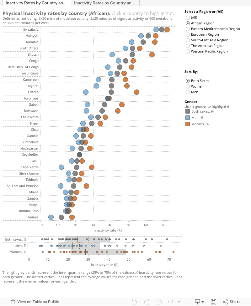
Today (July 18, 2012) the Guardian Data Blog asked the question, "Which are the laziest countries on earth?". The data they used is from the British medical journal The Lancet. To visualize the data, the Guardian used Tableau Public. You can see the interactive work below:
This visualization uses a chart type dubbed a 'Lollipop Chart' by Andy Cotgreave when he worked with the DataStudio (). Andy identified the features of this techique this way:
1. Can be used when all dimension members have high values (i.e. long/tall bars in a bar chart)
2. Greatly reduces the data-ink ratio while maintaining a clear link to axis labels
3. All the users I’ve shown it to so far have really engaged with it – they think it’s both pretty and easy to read
I also like the fact that it works if you add more dimensions to make small multiples:
The first question I had when I saw the Guardian's outing of the laziest countries was, "How do countries within a region stack up against each other?" I also wondered if gender sorted differently for the countries within a region. Then there was the whole issue of averages and variability. As it was published, the Guardian visualization didn't get me there for any of these questions.
One of the hurdles for me was the lollipops themselves. In this example, they take up way too much space for my liking. So, I downloaded the workbook from Tableau Public and made some changes.
One change I made was to use a dot plot instead of a lollipop chart. This saved two lines for each country pane, and showed me more quickly the differences by gender within a country. I also added a filter for the region, so I could see all the countries in a region at the same time instead of having to scroll and remember. Thirdly, I added a parameter to make sorting flexible and interactive. Finally, I added a multi-dimensional strip plot so I could see the distribution of values for each country, one gender at a time.
Combining all these changes together results in the following interactive exploratory analytical tool. Play around with it and let me know if you get more insight about the laziest countries.
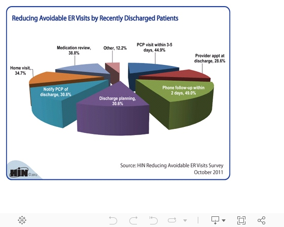
Earlier today I received a message to look at this "cool pie chart" from the HIN.com web site. The chart is supposed to show the percent of respondents to a survey who answered a question about actions ERs could do to reduce repeat ER visits by recently discharged patients. They gave away this image for free, encouraging readers to copy and use it in their own blogs or web sites, with complete attribution. Or, you could buy the report that includes this chart for $127.
HIN's Reducing Avoidable ER Visits e-survey conducted in October 2011 captured how 134 healthcare organizations are working to staunch the flow and expense of avoidable ED use and point low-acuity patients in the direction of appropriate care. According to survey respondents, some effective strategies to reduce avoidable readmissions by the recently discharged are:
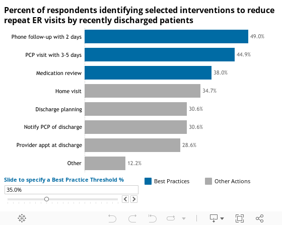
· Phone follow-up within 2 days: 49 percent
· Primary care physician visit within 3-5 days: 44.9 percent
· Medication review: 38.8 percent
· Home visit: 34.7
· Notify primary care physician of discharge: 30.6 percent
Not good. Don't do this.
Pies are for dessert (apple or pumpkin, please), even if there are only two slices (one for me - say 80%, and one for you - say 20%). Otherwise we are going to fight over whose piece is bigger, because the human brain doesn't visually process angles well at all.
In this case though, the larger offense to the viewers and their brains is that you are supposed to suspend what you know about pies (all the slices taken together are supposed to equal the whole pie - 100%). Here the pie is apparently larger than the sum of its parts. What the author is really trying to convey, we think, is that the question was multi-select, so respondents could choose all that apply. So it is not a parts to the whole problem. To convey the percent of respondents who answered each choice, an ordered bar chart does the trick, or simply a sorted text table. Here is how an ordered bar chart might look. It conveys all the information or the original with no cognitive load (extra processing effort) in a smaller space. And the little Best Practice threshold parameter let's the author and consumers of the data clarify their POVs interactively if necessary. It is clear which interventions are more recommended than others, and by how much -- for example, a phone follow-up at discharge had nearly twice as many mentions as offering a provider appointment at discharge. We can deduce this even without the value labels, because the human brain is much better at deciphering differences in length.