
It caught the eye, but on further inspection seemed to me a bit confusing and misleading. So, in this post I explain why and offer some alternatives.
Four-leggeds vs Humans
Among other facts, the article reports the magnitude of the current situation. It specifies the number of adopters who will use various methods of adopting, i.e., Swingers (can be persuaded to adopt from a shelter or rescue), Definitely using a shelter or rescue, Definitely using a breeder. So these are the adopters, not the pets. The article also mentions the unfortunate evidence that 4 million pets are "unadopted" from shelters and eventually euthanized, that is, pets not people. The graphic tries to portray the quantitative differences between the types of adopters and the number of euthanized pets using scaled abstract images of pets for each case. Two different messages, but the same metaphor -- not the best approach. When I first looked at this image in the printed version, I figured it was trying to communicate that 17 million large dogs, 5 million small dogs, 1.5 million rabbits, and 4 million cats were adopted from shelters. Then I read the captions on each pet image, but still wondered why pet images. Brain pain. There had to be a clearer way of communicating this message.
Not for the color blind
Adding insult to injury, maybe, the image seemed to me to be not optimized for color blind viewer, or even for viewers wanting a relaxing visual experience. To test this, I submitted the images to the Vischeck web site. It has a detailed info page with links to other sites like this one for research and testing.
Naomi Robbins recently talked about this subject, and Vischeck in her Forbes blog.
Here are the Vischeck results:
Deuteranope (a form of red/green color deficit)

Protanope (another form of red/green color deficit)


Interestingly, the rare person with tritanope color deficit would at least see that the three pets associated with adoption intentions are in the same hue family and should perhaps be considered together, while the cat image related to euthanasia is a completely different hue. But most folks with color deficit will get little to no visual clues from the colors used.
Some Alternatives
The point of visual data analysis and data visualization is data sensemaking. It is usually not necessary to invent new schemes or metaphors to make the data come alive. For one thing, more often than not, these new inventions or trendy displays obscure the message or story in the data. Also, it is very hard to do easy well. And, the new-fangled stuff usually hurts the brain, big time. So, what that leaves is using visual displays that incorporate best practices, something Tableau Software does by default. And, this applies to data journalism as much as it does for hard-core statistical analytics. Stephen Few has a very comprehensive discussion on this subject in Criteria for Evaluating Visual EDA Tools. The sensemaking task with the pet adoption data is basically a Part-to-Whole and Ranking Displays exercise. Few discusses this in detail in Chapter 8 of his popular book Now you see it: Simple Visualization Techniques for Quantitative Analysis. In the Tableau dashboard display below I present four alternatives to the menagerie version published by City Beat.
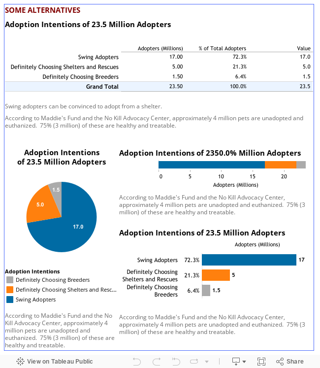
The crosstab shows all the data, both the raw data and percents of total. Maybe that is all that is necessary. It is clear which intention is most common. It also does not mix adoption intentions with euthanized pets. Notice the caption note explaining the Swing Adopter.
The three graphs use Tableau's color blind palette, which yields this color perception result when passed through Vischeck:

The pie chart shows very little. However, in this case, since the three intentional statements have very different response levels, the pie seems to work. However, the pie chart is inherently messy, and should be avoided. Again, I have tried to mitigate this by providing tooltips that fill the the information gaps -- categorical labels, percents, and notes.
The stacked bar chart shows the raw cumulative raw counts of adopters segmented by intention. It takes up very little space. It is possible to gauge the relative prevalence of the intentions compared to each other. Hover over any segment to see both its raw count and percent of total adopters (a bit more information and somewhat less direct). Again, the information about euthanized pets is not directly available. Notice, too, that the tool tip for Swing Adopters includes some additional explanation about swing adopters.
The bar chart in the lower right hand corner most closely illustrates a best practice for this analytical question. Bars encode values as lengths, a pre-attentive characteristic easily handled by the human visual system. They are much more suitable for encoding differences in the value of a single measure across one or more dimensions. In the example, like the other alternatives, all the relevant data is directly available to the viewer, or just a tooltip away.
Bottom line, even though a question or some data you want to visualize and share is simple, you should make every effort to communicate the story in an unambiguous manner, being respectful of your audience's brains. First, do no harm.
I think what causes a lot of the "brain pain" is editors and authors wanting to attract readers. While your visualizations make much more sense of the data, they will turn off the non-analytic consumer (the people who fall asleep instantly when a chart of any kind is placed before them). I empathize with their struggles to try and be engaging to a non-data audience while trying to convey meaning with data. I imagine it's a hard line to walk. The marketer in me tells me they error on the side of using alluring "blinky lights" visualizations because that audience is larger.
ReplyDeleteImpressive. This blog is so helpful! My Arizona SEO team feels so informed right now. The data you've shared means a lot to us. Keep blogging and we really really appreciate the things you've shared. Have a nice day!
ReplyDeleteFor friends who wanna office 2013 product key,visit this site: www.productkeydownload.com Fast delivery, and the keys are genuine!
ReplyDeletesimply superb,mind blowing, i will share your blog to my friends also
ReplyDeleteTableau Online Training
The solutions design and the development strategies related to iot services offered by this article have proven to help understand the platform identification
ReplyDelete