Simon used a mashup that involved Google Maps. It seemed to me that without much effort the same or similar could be done with Tableau. So, starting with the data link in the Guardian article, I ended up with the following viz. Easy peasy for Tableau.
The dashboard design challenges that presented themselves were allowing 1) the viewer to select a measure to review, and 2) managing the legends so that they respected the conceptual features of the Guardian version. To start with, I decided to try to accomplish these objectives in Tableau without changing the data structure. The date presented by the Guardian is a typical pivoted Excel table, with a row for every state followed by many columns of measures -- one for each subject of interest. Not ideal. The discussion below outlines the basic approach that other Tableau practitioners have documented in blog post.
Changing the measure
The Guardian version uses a drop down box above the Google map that allowed the viewer to select a single measure of interest. To accomplish this in Tableau requires using a parameter and at least one calculated field. The parameter holds the choices, which are string surrogates for the measure columns in the data. The calculated field(s) hold values for the measure of interest, and set titles. The parameter, named "Show this...", looks like this:

A CASE calculated field, called "This indicator", has the following definition:
case [Show this ...]
when 'No tax liability' then [The 36%: percent of tax filers with no liability]
when 'Poverty' then [The 15%: percent living in poverty]
when 'Tax returns over $1 million' then [The 1%: percent of tax returns over $1m]
when 'Veterans' then [The 7%: percent of population who are veterans]
when 'On Medicare' then [The 15%: percent of population on medicare]
when 'Without medical insurance' then [The 16%: percent without medical insurance]
when 'Unemployed (July, 2012)' then [The 8%: percent unemployed (July 2012)]
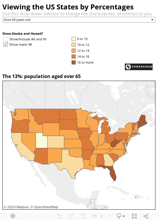
when 'Over 65 years old' then [The 13%: population aged over 65]
end
A second CASE calculated field, called "Indicator Legend Label", looks like this:
case [Show this ...]
when 'No tax liability' then 'The 36%: percent of tax filers with no liability'
when 'Poverty' then 'The 15%: percent living in poverty'
when 'Tax returns over $1 million' then 'The 1%: percent of tax returns over $1 million'
when 'Veterans' then 'The 7%: percent of population who are veterans'
when 'On Medicare' then 'The 15%: percent of population on medicare'
when 'Without medical insurance' then 'The 16%: percent without medical insurance'
when 'Unemployed (July, 2012)' then 'The 8%: percent unemployed (July 2012)'
when 'Over 65 years old' then 'The 13%: population aged over 65'
end
It sets the title above the map to correspond the to measure selected from the parameter drop-sown list.
Standardizing the legends
In the Guardian version, regardless of the measure chosen, the thematic map uses four or five classes, with a consistent color range for the legend. The class boundaries change depending on the range of values in the data for the selected measure.
To accomplish this in Tableau requires some planning and manual color legend adjustments. First, I made another CASE style calculated field, called "color legends" as follows, based on the value of the Show this... parameter:
case [Show this ...]
when 'No tax liability' then
if [This indicator] <=25 then '0 to 25'
elseif [This indicator] <=30 then '25 to 30'
elseif [This indicator] <=35 then '30 to 35'
elseif [This indicator] <=40 then '35 to 40'
elseif [This indicator] >40 then '40 or more'
end
when 'Poverty' then
if [This indicator] <=5 then '5 or less'
elseif [This indicator] <=10 then '5 to 10'
elseif [This indicator] <=15 then '10 to 15'
elseif [This indicator] <=20 then '15 to 20'
elseif [This indicator] >20 then '20 or more'
end
when 'Tax returns over $1 million' then
if [This indicator] <=.01 then '0.0 to 0.01'
elseif [This indicator] <=.12 then '0.01 to 0.12'
elseif [This indicator] <=.24 then '0.12 to 0.24'
elseif [This indicator] <=.5 then '0.24 to 0.50'
elseif [This indicator] >.5 then '0.50 to 0.60'
end
when 'Veterans' then
if [This indicator] <=6 then '0 to 6'
elseif [This indicator] <=7 then '6 to 7'
elseif [This indicator] <=8 then '7 to 8'
elseif [This indicator] <=9 then '8 to 9'
elseif [This indicator] >9 then '9 or more'
end
when 'On Medicare' then
if [This indicator] <=8 then '0 to 8'
elseif [This indicator] <=11 then '8 to 11'
elseif [This indicator] <=14 then '11 to 14'
elseif [This indicator] <=17 then '14 to 17'
elseif [This indicator] >17 then '17 to 25'
end
when 'Without medical insurance' then
if [This indicator] <=5 then '0 to 5'
elseif [This indicator] <=10 then '5 to 10'
elseif [This indicator] <=15 then '10 to 15'
elseif [This indicator] <=20 then '15 to 20'
elseif [This indicator] >20 then '20 or more'
end
when 'Unemployed (July, 2012)' then
if [This indicator] <=5 then '0 to 5'
elseif [This indicator] <=7 then '5 to 7'
elseif [This indicator] <=9 then '7 to 9'
elseif [This indicator] <=11 then '9 to 11'
elseif [This indicator] >11 then '11 or more'
end
when 'Over 65 years old' then
if [This indicator] <=10 then '0 to 10'
elseif [This indicator] <=12 then '10 to 12'
elseif [This indicator] <=14 then '12 to 14'
elseif [This indicator] <=16 then '14 to 16'
elseif [This indicator] >16 then '16 or more'
end
end
Next, I dropped this calculated field onto the color shelf. Then, one at a time, I changed the measure of interest, which changed the color shelf so that it only included the classes associated with that measure. For each measure, I set the color of each class such that the lowest ordered values always had the same color RGB value, and so on through each class member for each measure.
The map and tooltips
The map itself is a filled map mark type. It uses the Gray color scheme, with only the Base and Country Borders options turned on, and Washout set to 0%. This provides the cleanest presentation of state boundaries.
The elements called out in the tooltip:

are on the Level of Detail shelf to make them available to the tooltip editor. The look and feel come from Tableau's RTF editor controls.
Download the workbook to learn more.
Thank you for your guide to with upgrade information.
ReplyDeleteTableau Online Training